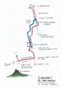
Hand-drawn maps are like good technical documentation
I loved this excellent article by Julia Turner on Slate about hand-drawn maps — the kind of maps you draw so your cousin can find your house, or your buddy can find the boat launch. In these days of Map Quest, Google Maps, and turn-by-turn GPS directions, a hand-drawn map can seem like an anachronism. But when you sketch out a route on a Burger King napkin you’re providing better clarity, customization, and resolution than the latest smart phone app.
The crucial advantage of the handmade map is that it is designed for a particular person confronting a particular task.
Like good technical documentation, a casual hand-drawn map is designed for a specific purpose. It therefore leaves out the unnecessary bits and simplifies the presentation of the key information as much as possible. Take roads for example:
Handmade maps also tend toward straight lines and right angles, a phenomenon spatial psychologists refer to as “rectilinear normalization.” The world is full of squiggly roads that intersect at oblique angles. When we envision space, though, we tend to reduce such complexities to relatively simple geometric forms.
And one more example of how hand-drawn maps are like tech docs:
Another advantage of personal cartography: Homemade maps often include error indicators, signs that you’ve taken a wrong turn or gone too far.
Turner provides a link to the Hand Drawn Map Association website, which is worth checking out as well.
(Slate via Boingboing)
(map: Laura Watson via Slate)


